The Top 3 Best and Worst NBA Alternate Uniforms
With the holidays fast approaching, it’s time to grab some eggnog, light the fireplace, and of course, don the annual ugly sweaters. To celebrate this timeless occasion, we’ve listed the three best and three worst alternate uniforms of NBA teams for the upcoming season.
Top 3 Best
Brooklyn Nets
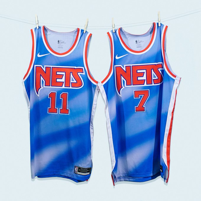
Starting this list off, the Nets once again add to their extensive history of great uniform sets with this homage to the Drazen Petrovic and the New Jersey Nets of the 1990s.
The classic red Nets logo with the powder blue and red trim are the ingredients to a masterpiece, and these jerseys set up some great possibilities of player-exclusive kicks in the Kyrie Irving and Kevin Durant signature shoe lines with Nike.
Portland Trail Blazers
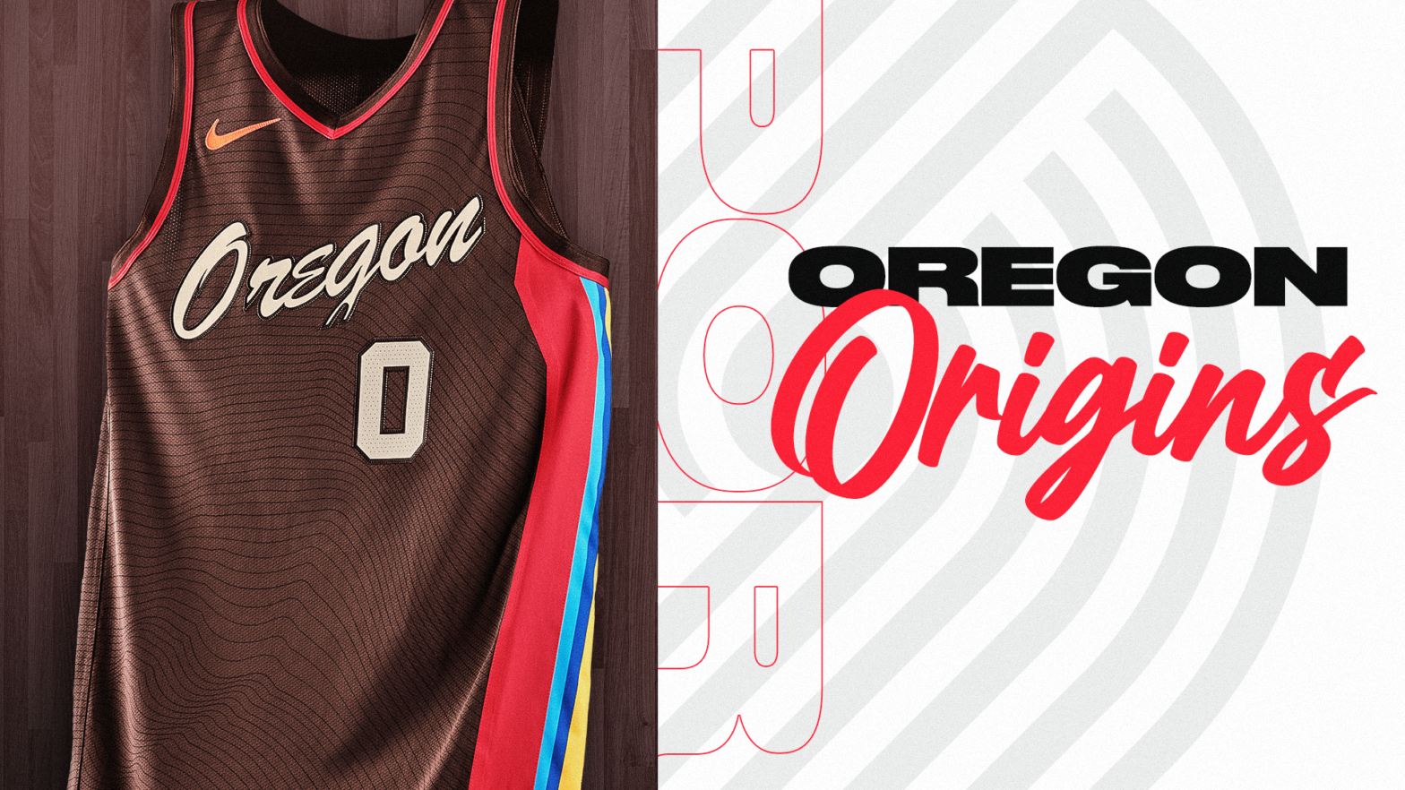
Moving out west, the Trail Blazers knocked it out of the park with these uniforms, paying homage to the landscape and Native American culture of Oregon.
The multi-colored striping on the sides of the jersey refer to multiple landmarks around the state of Oregon, which complement the primary Earth tone of the jersey in a storm of beauty.
On the side of the uniform, the red pays homage to the Woodburn Tulip Festival, the lighter blue represents the vibrant downtown area of Portland, the dark blue signifies the famous Crater Lake, the yellow honors the golden sights of the state’s coast, and the orange shouts out the John Day Fossil Beds.
However, the best feature of this set is the Nike logo printed in its original orange, honoring the company’s roots in Portland.
Overall, this uniform serves as a rare anomaly of earth tones and subdued colors, coalescing into a fantastic uniform.
Philadelphia 76ers
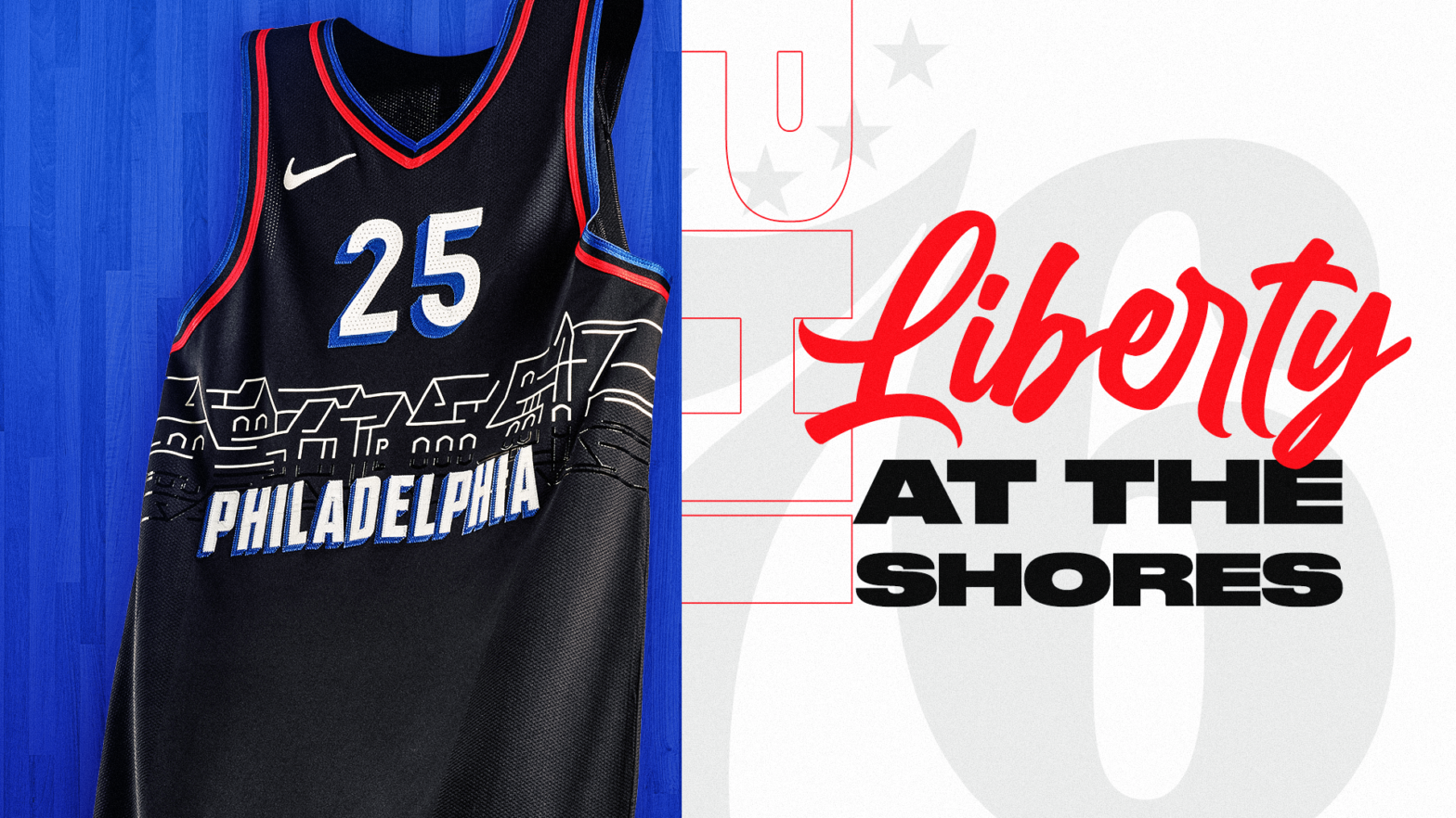
In one of the most radical uniforms to be revealed this season, the 76ers brought back the black primary color for the first time since the 2008-09 season but with a whole new look.
These jerseys contain an outline of Boathouse Row, one of the most captivating landmarks in the City of Brotherly Love, which wraps around the whole jersey to honor the city’s intense rowing culture and the intense work ethic this team possesses.
Top 3 Worst
Milwaukee Bucks
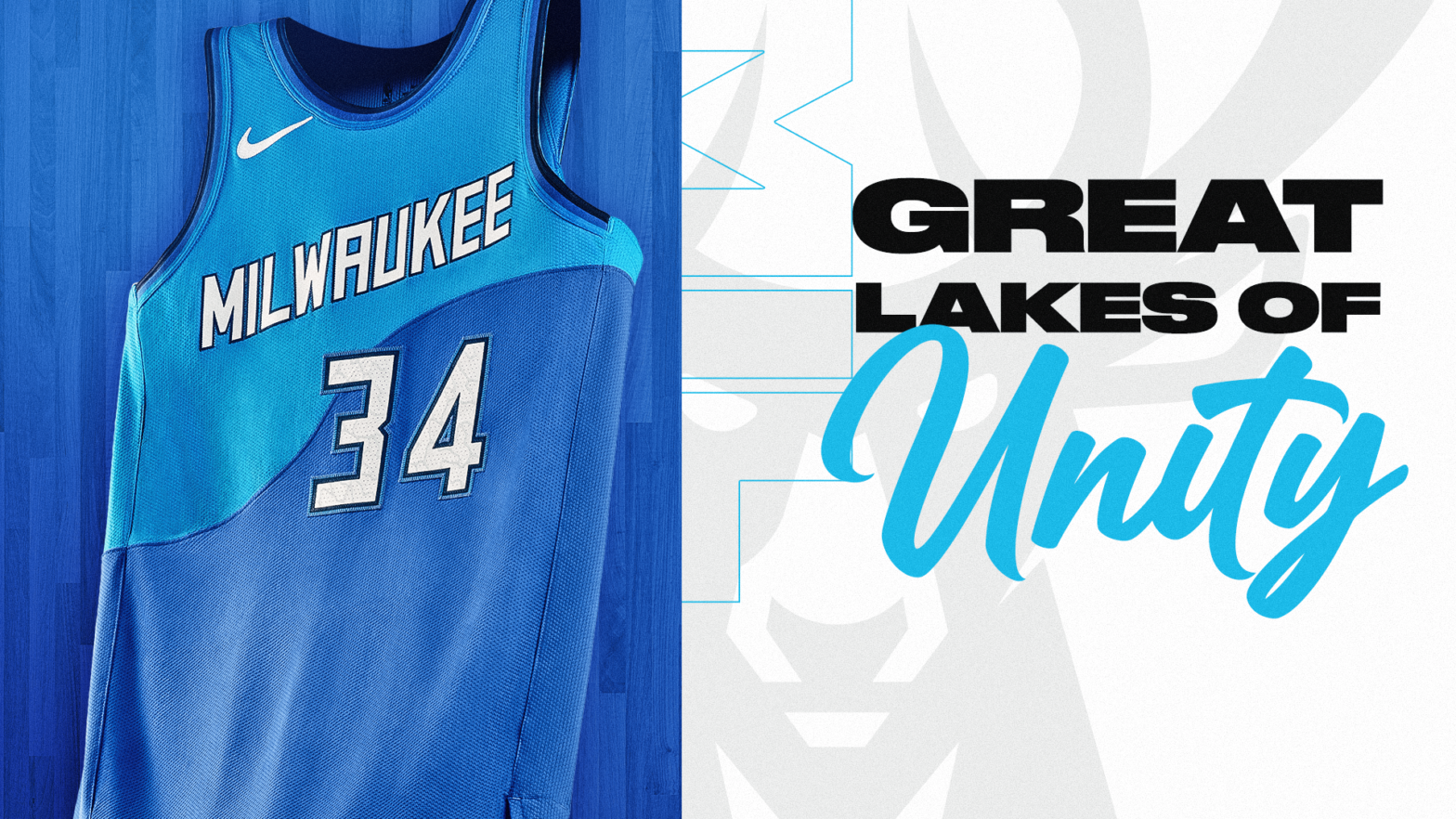
Entering this season, the Bucks are facing enormous pressure to succeed if they want any chance at resigning Giannis Antetokounmpo. These jerseys are not the right step towards success.
The hideous blue shades that cover this uniform are atrocious and unwarranted, and the partition in the middle of the uniform makes this one of the ugliest uniforms in recent NBA history, even topping the 2018-19 bright yellow Bucks alternates.
Sacramento Kings
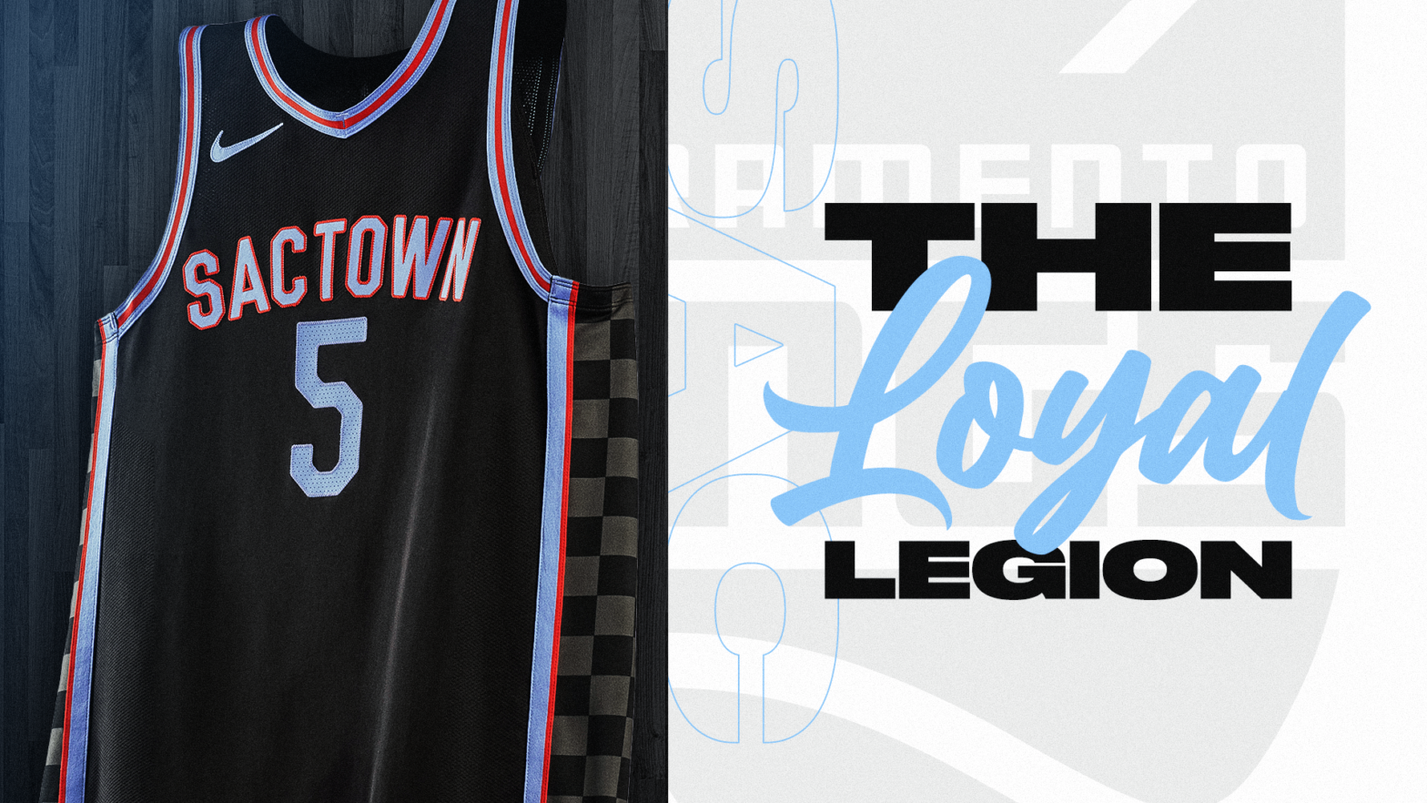
Sacramento’s utilization of purple, white and black have produced some of the sleekest uniforms over the last two decades, but the Kings completely whiffed on this rendition of their alternate uniforms.
The checkerboard paneling on the side calling back to the Mitch Richmond-era Kings was a good nod to the past, but this uniform just lacks creativity, donning a generic font with a reddish-orange trim that does not complement the jersey at all.
Sacramento’s marketing department threw together a Frankenstein of jersey that falls flatter than a pancake.
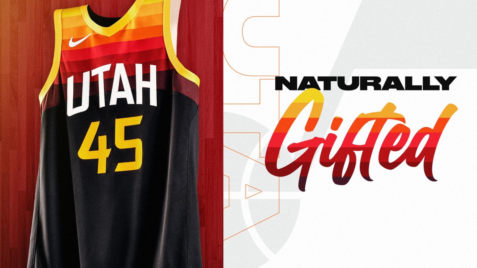
Utah Jazz
The only question from this jersey set: why? The original yellow and orange alternate jersey was one of the more creative color schemes in the NBA, but adding black to the bottom of this jersey makes it a travesty of an NBA uniform.
The Jazz tried passing this alternate as a “Dark Mode” changeup, but this reveal just came off as lazy and uninteresting.
Utah has stars in Rudy Gobert and Donovan Mitchell, but when these stars play in Salt Lake City, which is not the most attractive city for free agents, the uniforms become another tool of marketing, These jerseys ultimately seem dull and not creative enough to make the Utah capital any more appealing.
Matthew McLaughlin is a freshman majoring in broadcast journalism. To contact him, email mem6936@psu.edu.


